Thursday, September 27, 2012

Design Thinking For Students: The Question Formulation Technique

Source: Edutopia
This summer we signed up for a free online module in design thinking. Organized jointly by Edutopia, IDEO, and Riverdale Country School, the "Design Thinking For Educators" workshop invited participants to model the real process of iterative creation. Design thinking has been gaining traction as a means to foster critical thinking and creativity among learners. Teachers, in fact, can download a toolkit in the methods of design adapted for education.

The spring 2012 issue of Independent School magazine featured a detailed article about the prospects for design thinking to revolutionize standard classroom practice. In "An Experience Of "Yes": Independent Schools Begin To Explore and Exploit The Power Of Design Thinking," Peter Gow describes this mindset as "the posing of a problem, perhaps elegantly framed but more likely ill-structured or open-ended -- and with some constraints." This collaborative exploration requires "critique, testing, retesting, and redesigning until a breakthrough is achieved." In a safe, trusted setting, a feedback model that embraces failure is the ideal paradigm for student discovery.

Source: Design Thinking For Educators
We've found that the design thinking process works well in project-based learning and in interpersonal student scenarios. For some real classroom examples, check out:
One easy but surprisingly effective way to incorporate the steps of student-centered design is through the Question Formulation Technique (QFT). Rather than a multi-week project, this cooperative investigation takes one class period (or less) and empowers students to create a blueprint for their own curiosity. They ultimately chart the direction of their entire learning "unit."

Source: The Right Question Institute

Although it was perhaps not initially intended to mimic the design thinking approach, the Question Formulation Technique springs from an initiative at The Right Question Institute that aims for students to "learn how to produce their own questions, improve them, and strategize on how to use them." This scaffold closely follows the "discovery, interpretation, ideation, experimentation, and evolution" procedure of designers. For a full description of the technique, we highly recommend this informative explanation from The Right Question Institute.

Source: The Right Question Institute, ASIDE

The QFT applies to all levels of schooling and can be employed "to introduce students to a new unit, to assess students’ knowledge to see what they need to understand better, and even to conclude a unit to see how students can, with new knowledge, set a fresh learning agenda for themselves." The QFT basically validates students' natural inquisitive sense when starting new research or beginning to write an essay. It formalizes in a helpful way what can sometimes become rushed or quotidian.

Source: The Right Question Institute, ASIDE
The essential QFT process is student-initiated, with the teachers as facilitators. The six QFT steps, as originated by The Right Question Institute, are as follows:
  1. Teachers design a Question Focus (or QFocus) - With a prompt, a dilemma, or a guiding statement, the teacher frames the inquiry to point the children in a beneficial direction.
  2. Students produce questions - Using a set of guidelines (listed above), the children generate questions based on their own curiosity and wonder.
  3. Students improve their questions - The groups of students then refine and modify their lists based on an understanding of open- and closed-ended questions.
  4. Students prioritize their questions - Through discussion and debate, the students choose specific questions they would genuinely like to probe further.
  5. Students and teachers decide on next steps - As a group, the kids and adults together decide how to use these core questions to guide the coming days and weeks of classes.
  6. Students reflect on what they have learned - By looking back over the process they have just pursued, students explore the value of self-initiated experimentation.
Source: The Right Question Institute, ASIDE
With our eighth-graders at the beginning of this school year, we used The Right Question Institute suggestions to remind the group about last year's study of the Civil War and to imagine what life must have been like in the Reconstruction-era South for the population of newly freed slaves. The questions the class generated ranged from personal to philosophical. In the end, the group chose three guiding questions (in blue) to form the foundation of our next three weeks. We have returned to these questions daily, to ponder after new readings and to flesh out with primary sources.

For additional reading about design in the classroom, check out "Design Thinking: Lessons For The Classroom," from Betty Ray at Edutopia.

Note: This post has been updated to reflect accurate sourcing (Sept. 28, 2012).

Saturday, September 22, 2012

Autumnal Infographics As Teachable Moments

Source: Love Infographics
It's only fitting that we share some infographics for the change of seasons. After all, autumn does affect just about every aspect of our daily routines, from the shorter day to the series of holidays beginning with Halloween to the New Year. The infographics for the fall season reflect this pattern, from what we buy to where and when to see the best fall foliage.

Why not take advantage of these data-rich delights with all their living color to teach a little autumn trivia, devise a few math problems, or map out a geographic trail across the United States for the best leaves? There is plenty of information to go around, and it might even spur a debate or two in comparing the details. No matter what your discipline, mini lessons abound from these eye-catching displays of words, pictures and numbers. Here are just a few of our favorites.


Source: Home Away (detail)
Raking in the Facts on Fall is loaded with data on everything from leaves changing color to the optimal size a leaf pile should be before you dive in. Use it to find out the number of tons of leaves falling in an acre or the number of people injured due to leaf disposal. It's good for math lessons, general trivia, or story starters. Another infographic from this site is What Are People Buying In the Fall?. Once again, this is a helpful visual to start a discussion on buying patterns or making predictions. It also can be used in connection with reinforcing media literacy skills.

Tap your students' knowledge of the United States using Indulge in Fall Foliage from Home Away with its beautiful colors and engaging layout. Integrate the information from this infographic with social studies classes. It's helpful for understanding geographical regions, and with a road atlas, kids can plan a trip using the detailed travel information to route their way visually across the country.

Source: AccuWeather (detail)
We know that many kids suffer from allergies, and spring is no different from fall. The AccuWeather infographic on Autumn Allergies provides lots of details in a colorful visualization on ragweed, mole spores, dust mites, and more.

This one, along with Which Produce is In Season? from GE, provides lots of connections to science and math classes. The charts about seasonal fruits and vegetables make for excellent resources to reinforce graphicacy skills. Even our youngest learners can use this infographic with its colorful image icons and calendar data to decode information.

Lastly, use the visualization Climate Change and Changing Fall Foliage - A Little Less Colorful from the Environmental Law Prof Blog to have students in the Northeast analyze the three maps showing the change in fall color over the next century based on emissions. It will help to enhance and reinforce their visual literacy skills.

Source: Environmental Law Prof Blog
Click here for other posts on seasonal and holiday infographics.

Wednesday, September 19, 2012

Sketchnotes & Visual Thinking: A Different Way of Note-taking

Source: Craighton Berman, Core77
Recently we had the opportunity to attend the Visual Thinking 101 Workshop with designer and illustrator Craighton Berman at the General Assembly in New York City. Berman started the Core77 Sketchnotes Channel and Coretoons, and he writes about the basics of sketchnoting on his blog.

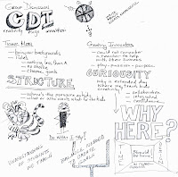
Essentially, sketchnotes are a form of visual note-taking, combining text and images. This is different from graphic facilitation, which is when one person listens to a group and graphically represents the key points of the discussion, such as with ImageThink and Ogilvy Notes. To the contrary, sketchnotes are a personal form of note-taking. Both, however, use the visual thinking process to design information in real time through words and images to communicate ideas.

Source: Craighton Berman, Core77
In most schools today, the current system of note-taking is a linear process and, in many cases, a rote process as well. Too often, we have students take down the information they need from the board, interactive or not, via handwritten information or PowerPoint slides. The interaction or engagement with the material is minimal. Sketchnoting is a higher order process of capturing information. It requires a combination of listening, thinking, and visualizing at the same time. It goes in a constant circular motion and pushes the listener to funnel through the information for the most important parts or patterns. By filtering out the noise, the sketchnoter learns to look for patterns or an anchor around the main idea to focus on the key aspects that support it.

Source: ASIDE, 2012
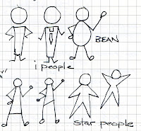
In the workshops we've taken, the instructor had us practice by listening to a recording or video. Of course, the first line of resistance might be "I can't draw," but with sketchnotes, you don't need to be an artist. It doesn't take much practice to learn the basics of using shapes as people, and with simple, hierarchical visuals, it's easy to add images in the form of containers, icons, or connectors.

The visual cues in sketchnotes enhance the recall process. The user experience with information is broadened, execution is minimal, and it opens up the design process to think about the relationship between the text and image. Essentially, it's about organizing information visually and arranging it in a hierarchy, and this spatial arrangement of information provides a structural framework for the content.

Source: ASIDE, 2012
Since we've sketched out "The Axis of Education" as a matrix for what and how we teach, our hope is to continue to seek ways to build a sense of discovery in helping students learn. And in the end, what they learn and how they learn can only be advanced by giving them more opportunities to be creative thinkers. If moving them closer to thinking like a designer can transform the way they learn, then sketchnotes is one option we should try.

In the larger sense, Craighton Berman's visit to New York coincided with the launch of the School of Visual Arts inaugural Products of Design MFA Program, which hopes to transform designers by:
"educating their head, heart and hands to reinvent systems, create new types of value, and catalyze positive change through the business of making." 
We dare say, isn't this what we want as educators for our students, too? From icons to iPads, our students are constantly immersed in using visual cues to think, make, and do things.
Source: Craighton Berman, Core77

Sunday, September 16, 2012

The Axis Of Education - Changing The Teaching Matrix

Source: ASIDE


Is creativity an end, or a means to an end? In education, this question has no easy answer. At times, creativity serves as a vehicle for inspiration, while at other times, originality is the destination itself. For painters and poets, artistry is the conduit to new perspectives and phrases. For the basement tinkerer, innovation is the spark to invention. But schools do not produce inventions; they produce inventors. For this reason, to incubate the creative mind is a crucial role of the teacher. To foster imagination is a key pathway toward entrepreneurship and discovery. Ingenuity, therefore, resides in the upper quadrant of any educational schema.

(Click for a full-size version)
As teachers, we are in the process of putting together our goals for the new school year. At the top of our list is finding ways to nurture creativity in our students. We sketched out an "Axis Of Education" as a matrix to guide our development of lessons and activities. This coordinate system lays out the two variables of what we teach and how we teach, seeking an escalating ideal of skills and self-discovery. Since we try to guide our students in reading charts and graphs, it made sense to visualize our own objectives via an x/y axis.

The four quadrants within the matrix represent different teaching models, none necessarily better or worse than the other, but each distinct in the proficiencies it elicits in the student and in the roles it envisions for the educator. In the bottom left is the traditional classroom that relies on "ritual recitation," with a teacher at the front of the room and a host of facts to memorize. As the y-axis branches upward, the teacher is still in command, aiming for higher-order skills but maintaining a fixed, "one-size fits all" approach. Along the x-axis, the skills remain basic while the students enjoy freedom without guidance, risking a stabbing-in-the-dark, "pin the tail on the donkey" method. Ultimately, the upper right quadrant cultivates hands-on experimenters. By emphasizing original ideas in an entrepreneurial classroom, teachers create a laboratory of "experiential design," where children try and fail in the security of self-confident investigation.

In this blueprint, destructive teaching does exist. Heading in the negative direction are worksheets and scripts that might enforce rote facts but that undermine any expertise of the profession. Similarly, rushed units of study may result from good intentions, but the rapid pace and incomplete reflection time do more harm than good. Finally, standardized testing does the most damage. Not only does it vitiate every virtue of a teacher's training and passion, but it also chokes creativity and genuine learning.

If you would like a .pdf version of the "Axis Of Education" graphic, please click here.

Tuesday, September 11, 2012

Teaching With Logos - Making Branding History

Source: Lava360
We try to layer logos into our daily teaching as much as possible. Not only do they subtly help students become familiar with media literacy, but they also add pizzazz to bland handouts and SMARTboard files. Mostly, we acquaint our kids with logos because they fortify such a range of curricular lessons. Students are already investigating actual insignia of western cattle and heraldic crests. They identify the trademark signatures of John Hancock and Walt Whitman, and the presidential emblems of the 2012 election go a long way toward conveying personalities and messaging. Students also actively need to brand themselves, to take control of their online profiles and their future dossiers.

A terrific introduction to the history of branding comes via the stellar PBS Off Book series. "The Art Of Logo Design" features artistic insights about the evolution of branding, as well as interviews with experts in bygone "marketing." The PBS mini-documentary about Typography also beautifully expresses the basics of visual presentation.


A great activity for all range of age groups is to consider the "Branding Of America - Guess The Name." This fun exercise rewards the conscientious shoppers and the billboard watchers in our classrooms. It also helps our students become more attune to how corporations are targeting young buyers.

For a contemporary survey of creative promotions and crisp designs, we've been watching a 2011 video from the MSc Brand Leadership team at Norwich Business School. Entitled "What Is Branding?", this brief clip elegantly captures the fundamental concepts of graphic communication.


We also recommend two superb galleries of well-curated media literacy and typography examples. For further reading, we suggest the following resources:

Friday, September 7, 2012

Look At Labor Day Visually With Infographics

Source: Business Pundit
Most students think of Labor Day as the end of the summer vacation, even if some kids start school before the official holiday. It marks the end of the beach season for sure. Yet for many, the true meaning of the holiday gets lost in the celebration of a long weekend. Few realize that Labor Day is considered the "working man's holiday," or that the term "labor" by definition means exhausting, hard, physical work.

Source: Zazenlife
It was created to celebrate the vast majority of the American population who provided the fuel behind this country's success as an industrial nation. It was first celebrated in 1882, and in 1894 Congress passed an act making the first Monday in September a legal holiday. We've put together a collection of Labor Day infographics in this post that can be used to engage kids in a discussion during this opening week of school. They are loaded with information for lessons in multiple disciplines. Like other holiday infographics we've written about in the past, they connect with calendar events during the school year.

While we are sure some kids might say that school is hard, physical work, it pales in comparison to the occupations represented in the infographics on the Most Hazardous Jobs in America from Zazenlife or the Workplace Fatality Data from the Huffington Post. Both identify the different hazards of occupations with statistical information on gender and ethnicity. The data will surprise and enlighten students to the hard facts of what workers face.

Source: Fast Company
The Labor Day infographic from Fast Company compares the job sectors such as agriculture, manufacturing, and services of the United States. In this visualization the data is compared to other industrialized countries for 1971 and 2010. It also provides the change in women's share of the labor force and unemployment for the same years.

The catchy design for Labor Day by the Numbers from Fixr uses a map of the United States to separate the different jobs and the number of people working in them. Check out the list of Top 10 Work Songs for the Labor Day BBQ or Top 10 Labor Day Movies and see if students know what they are. A little pop culture goes a long way in any lesson. Ask them to take a guess as to what they think most Americans spend their money on during the holiday weekend, too.
Source: Fixr
Source: Column Five
Just a few others to share with students include Vacation Time Goes Unused by Most Americans and How We Spend Our Labor Day. Interestingly enough, most Americans don't take all of their vacation. Many work on Labor Day, fewer than 25% use it to reflect on workers' rights, and still fewer think about the history of worker protection.

In a time of job uncertainty and difficult economic times, teaching students the hard facts about labor history and the financial impact on our country is important. It's fun to include the data on what we do to celebrate, but it is sobering to see how many people work in dangerous and life-threatening occupations.

Perhaps the most telling detail is how too few understand the true meaning behind it. These infographics give us an opportunity to talk to our students about the day as well as point out comparisons that are necessary for our students to know. As resources, they provide a wealth of data for lessons.
Related Posts Plugin for WordPress, Blogger...


Pin It